Summary
I’ve made a lot of website designs over the years. Most of them have been for websites I’ve thought of making and then gave up on, although some have succeeded in being used. I’ve worked on designs for other people occasionally, and might do more in the future, but if I create any new designs they’ll most likely just wind up here. If a design is active, its thumbnail will take you to the current url. If I still have a design laying around, the thumbnail will take you to a demo version of the design, otherwise it’ll just give you a screenshot.
Blissfull
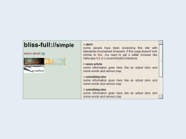
This is an experimental design I created one day while looking at some artists’ portfolio sites. Several of them were based on the idea of a small piece of content isolated in the middle, and this is my version of that. Of course, this design would never be used because there isn’t enough room for actual content and it requires frames, which is a serious accessibility issue. Unlike most of my recent work, it contains no PHP—just HTML and CSS—and I think it is the only design I’ve made using inline frames.
Brewmeister
This design was created basically to fill the web space in one of my accounts at school. It was created shortly after Blissfull, as evidenced by the use of the same colors and punctuation and similar layout. However, this design is even simpler—just a couple of div blocks and some basic styling. It’s an incredibly simple design, but it works.
Design-X
I believe this design was for a planned gaming site that was never established, and is one of my earliest experiments with PHP. It contains a function for creating blue-outlined boxes and sticking them in the empty space at the top. I believe I planned to have several of the small boxes in the empty space, containing recent or highly dynamic content. This is a fairly stereotypical example of my earlier work: lots of blue, darker backgrounds with white text, and anti-aliased curved borders. My modern work tends to use light backgrounds with dark text and single-pixel, squared borders, which is more readable and easier to implement with CSS.
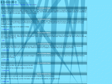
EdgeIRC version 1
Unlike many of the designs on this page, this one was put into use as the website for an IRC network. I ran one of the first servers on the network, and volunteered to create the website. The design uses a very narrow centered column with an imagemap menu at the top (inspired by the vector drawing mode in Paint Shop Pro, as I recall). All of the pages are served out of a single PHP script, a system I have since moved away from. I still like the look of the menu, but imagemaps aren’t used very much nowadays, and the rest of the design is fairly bland.
EdgeIRC version 2
After a year or two of using the first EdgeIRC design, the other admins and I decided that the website should be redesigned. This is the first attempt, and I liked the way it looked, but it was a little too much. On dial-up connections, the background images took too long to load, text was difficult to read, and the design broke considerably in Internet Explorer. In addition, the design carried over the single-PHP-script system from the first design, which I since replaced. With a standards-compliant browser, the background images stay fixed in place and it appears as if the headings are shaded, but this eye-candy effect wasn’t enough to justify the problems.
EdgeIRC version 3
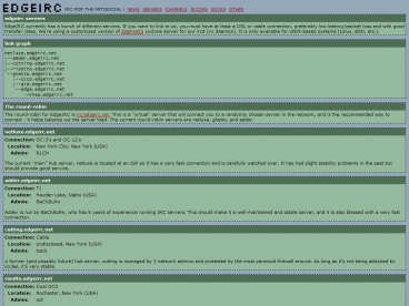
After the problems with the first EdgeIRC redesign, I decided to make something much simpler for the second attempt. This design uses only basic coloring and borders, which is not particularly attractive but is very usable and accessible. In hindsight, I almost prefer the original design, but at the time we just wanted something different. This design also introduced the EdgeIRC “logo” and a new color scheme that was carried over into the final design.
Electron Gaming
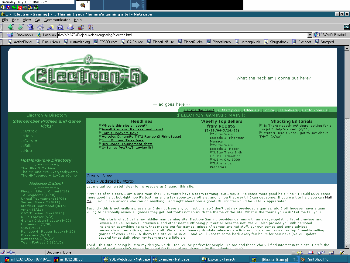
This is a design that I “re-engineered” for someone. They had a basic idea (color scheme, layout, and logo), but they needed help with the HTML. I rewrote everything, including the organization of the tables, and smoothed it out. Of course, if I had done this later, I would have used standards-based XHTML and CSS instead of tables, and I would have built it on top of PHP so that the pages could be dynamically generated. At the time, however, XHTML didn’t exist and CSS was still too new to make full use of.
First Business
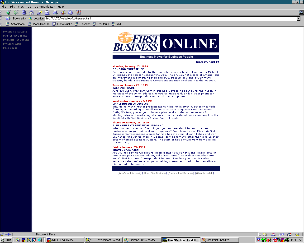
This design is a little strange. It’s just a rewrite, like electron gaming, but I think it happened a lot earlier. I can’t remember exactly why I decided to rewrite the design for a business news website, but I did, and I think I improved on what they had, a little. If I had done this recently, the side menu wouldn’t exist (I’d probably make a copy of the bottom menu near the top) and it would definitely involve a SQL database for storing news posts.
First-Person-Shooter Information Database
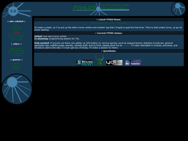
FPSID is one of the immediate predecessors of this site, along with YDL. It was intended to be a big gaming site with information on current FPS games, but I was never dedicated to keeping it updated and the site had no readership, so I never found anyone to help. At the time, all of my content was split between YDL (for “business”) and FPSID (for everything else). This resulted in a strange combination of gaming site and random personal stuff, like humor articles, so I eventually scrapped it in favor of a single personal site (which eventually evolved into wadny.com).
Hexographic
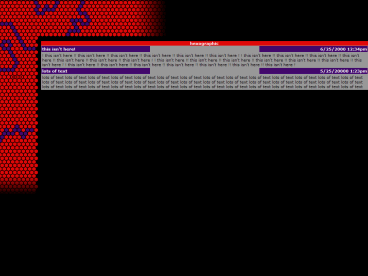
This design was actually inspired by a Linux screensaver with interesting animated colored hexagons that I thought I could turn into a neat website design. The plan was to animate the side and top images (the blue hexagons would light up in sequence), but that was difficult to construct and I gave up on the design before I finished any of the animations. The colors are rather ugly and the design isn’t very interesting any more, but the animation effect could be interesting if I had finished it.
the memory heap
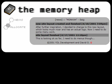
This was created sometime around the 2001 May 1st Reboot, as part of a plan to integrate the whole site together into a domain. I was planning on something along the lines of Everything2, one of the earliest wikis, where you could add stuff into a massive database—images, text, links, sounds, anything. Common sense (this would require lots of disk space, which costs lots of money) and laziness (the menu images were a pain to make) won, however, and the design was archived. It does have a few elements of this site, though—the icon (enlarged) and the random quote.
Planetgaming
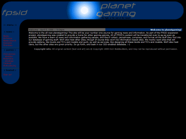
This is one of my older designs, from a period where I seemed to like using brightness gradients. I think I was trying to do lens flares, but it just looks a little strange now. This site was supposed to replace FPSID, but the vision was (like the memory heap) beyond my capabilities. I think I actually pitched the idea of a site like this to the GameSpy network, who already had their in-house team working on something. I was slightly peeved at the time, but now I don’t blame them for rejecting my design (it’s not that good). I never quite liked how the top and side were different sizes, and the site is far too dark.
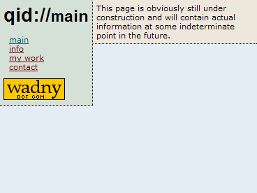
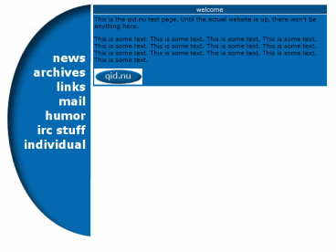
qid.nu
This design was one of the first two I created when I wanted to do a big reorganization of my site, but before I decided to unify everything in one design. They still required a lot of work to move some sections from one design to another—this is before I discovered PHP and how to separate content from design. Both of these designs were eventually superseded by a series of simple pages using the current yellow color, and I have no plans to bother with the qid.nu domain anymore.
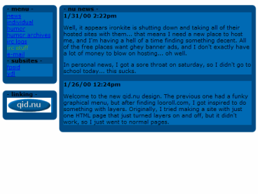
qid.nu-menu
This is a different design, intended to be used for the same purpose as the design above. I replaced it with the one above due to the difficulty of changing the menu. Both of these designs aren’t too interesting, and I chose some bad colors for links—the red is really difficult to read. I suppose it’s a good thing I never tried to use them. Also, the “individual” rant on these designs is from my “angsty teenager” days—I since moved on to “apathetic college student” and now “normal functioning adult.”
Unroyal
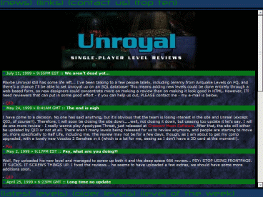
This was a redesign for an Unreal level review site, but I wound up pretty much starting over. I was starting to learn about how to make a website modular and easy to maintain, so I used some of those ideas in this site. All of the level reviews were in separate HTML files that could get included in any page, which was good, but I believed an SQL database would be better. Unfortunately, I hadn’t learned how to access one yet, only what it was. :-D Of course, this site was hosted on the GameSpy network, which had no idea how to properly set up a webserver (they used NT and, no doubt, IIS), so I probably would have had to learn ASP or something even more revolting. The site died anyways, due to lack of effort from level reviewers, so I didn’t get a chance to do anything with SQL until much later.
Useless
This was just a fun experiment in using Javascript and the fun and exciting new (at the time) concept of DHTML. The site that inspired it now has completely different content—it used to be a collection of very advanced Javascript/DHTML experiments. The random color changing squares should work in any Javascript-enabled browser, but “orange” has varying problems in anything besides NS4. Don’t worry, you’re not missing much, although the colored squares are a neat toy I still like to this day.
Wadny
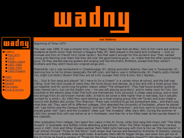
This was the original site for the band Wadny, of which my father was one of the founding members. All of the content for this site is now in the Band section, so, unlike most of the other sites here, this one is still around, sort of. I still like some of the fonts and basic layout, but the orange color is definitely wrong—it’s supposed to look like copper, like the etched logos that were actually made for some of the band equipment. This site is one of the few on here that was actually up and running, although I never got everything up at once—it was always hosted on ISP accounts with limited space, so the sample music files were somewhere else.
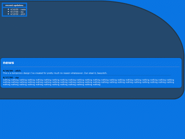
YDL-new
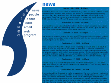
This was the replacement design for YDL, although even it is pretty old. The concept of YDL had gotten far less ambitious—now it was mostly there for me to show off stuff that would be acceptable on a résumé, like website designs and various things I had coded. This design was less ugly than the old one, although the layers and Javascript got pretty complex (and it no longer works). There were a couple problems I never quite solved, although they weren’t very major. All the content on this site that’s still relevant is in the current design, so don’t worry about all the non-functional links.
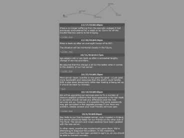
YDL-old
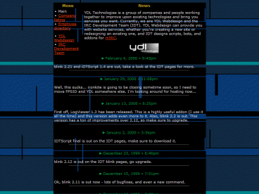
This was the first design I created for YDL, which was my “business” site. I planned to do website designing (and hopefully earn some money) and distribute mIRC scripts, but the web design never really took off and I’ve never been able to find anyone good at making mIRC scripts who won’t disappear. YDL was redesigned after a while, and the second design was much better—and more complex—than this one. I can pretty much guarantee that none of the info on this site is accurate any more.